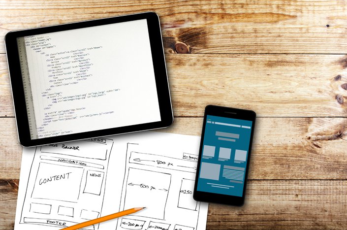
Mobile devices have forced designers and developers to rethink how they approach building webpages. Smaller screens demand layouts that are lean, simple and scalable. Designers must identify the most critical content first and design around that content. This changes the way pages are created for all screen sizes, encouraging more streamlined experiences from mobile to desktop.
Today, over half of all digital media consumption is done on tablets or smartphones.
People expect seamless transitions as they access websites across a variety...
Read More


 This is part 3 in a series of posts about how to write content that people actually want to read and share. Part 1, which you can read