One piece of advice included in almost all articles about branding and design is this: simplify everything. Reduce noise and clutter in your design, distill content down to is essence and stop trying to shout louder than everyone else to be heard.
Marketers give this advice because it works. Having too many choices prevents consumers from making a purchasing decision. Being confronted with too much visual noise prevents visitors from being able to effectively navigate a website. Simplicity is key to understanding and critical to effective communication.
But what does it mean to simplify? How can your firm present a cohesive message that is easy to connect with visually, intellectually and emotionally? Removing elements from a layout or article will not automatically make either of those items more effective. Simplicity must be intentional.
Here are some practical ways your firm can simplify its branding to make a bigger impact.
Simplifying your message
People who are looking for an attorney want to know a few basic things: who you are, what you do and what benefit that provides for them. If you can't convey the answers in a straightforward manner, your potential clients will move on to find someone who can.
1. Ask obvious questions.
Try to look at your practice from the perspective of a novice. Then ask yourself questions from that point of view. It may feel like you are asking silly questions — the sillier the better. Start with basics like, What do you do? Why do you practice? What does [any practice area] mean?
Your ultimate goal is to explain yourself and your services to an audience in a way that is comfortable and relatable. You cannot approach that task effectively if you take the attitude that you already know everything. Be curious; you may find that describing what you do clearly and without jargon is more difficult than you think.
2. Identify key benefits.
Prospective clients want to know what you do primarily so they can understand how it will improve their situations. Make a list of the ways your firm tangibly helps clients. Dig below sentimental platitudes and look at the real nuts and bolts of people's situations. What do clients get from hiring your firm?
Once you have made a list, narrow your benefits down to the top one or two — the ones clients seek most frequently. This will be the core of your message.
3. Develop personas.
How can you know what your core messaging should be if you do not know who is receiving it? Think of client personas like real clients. They are people with hopes, goals, fears, habits, likes and dislikes.
Basic demographic information like “women in their 60s” or “men earning below the national median income” is just a starting point for developing personas. Once you have the fundamentals, flesh out the lifestyles of these individuals. What websites would they visit? Do they have any hobbies? What do they value? Build two or three realistic people who can represent your ideal clients.
A good attorney understands intuitively how to address the concerns of clients when meeting face-to-face. Connecting with people through marketing messages should not be that much different.
4. Solicit feedback from clients.
Ask clients about their experiences with both hiring an attorney generally and working with your firm specifically. Client feedback is critical from a business development perspective. It allows you to see what aspects of your practice people most appreciate and whether there are any places the attorney-client relationship breaks down.
Client feedback also serves a valuable marketing function. Clients may give unexpected answers when asked what they are looking for in an attorney. And these answers can help you better hold the interest of future searchers. Never assume you are providing all the right information without consulting those who seek it.
Simplifying content
According to Searchmetrics, pages in the top ten search results score highly on the Flesch Reading Ease index. Flesch scores range from zero to 100 with zero being very difficult to read and 100 being very easy to read. Content that contains shorter sentences and words with fewer syllables scores higher. The average Flesch score for pages ranking in the top 30 results is 76. Less complex content is good for readers and SEO.
1. Do not write for lawyers.
Your website does not need to impress your colleagues. Its job is to impress prospective clients. Remove jargon, legalese and needlessly complicated words to make writing more accessible. If you cannot define a term clearly, remove it. Remember, you are trying to connect with your readers, not just make yourself look smart.
2. Use examples.
Prospective clients want to know what you do well, and examples can help show them in a way that stating you have experience cannot. You may not be able to reveal specific case information, but you can build case studies from composite client experiences.
If you can offer specific results and case histories, do so. Research continuously reveals that the top concern for people looking for a lawyer is whether he or she has experience handing their specific issue.
3. Think short.
According to the Flesch scale referenced above, a paragraph with a score of zero contains sentences that average 37 words or longer and words that contain more than two syllables. A paragraph scoring 100 uses sentences that are 12 words or shorter and words that contain no more than two syllables.
You can write less complex sentences without talking down to your readers. Start by noticing where you may have added superfluous words and qualifiers. Look for terms that can be explained more plainly. When writing for clarity, you can describe complicated ideas to intelligent people using language they can relate to.

4. Read out loud.
Reading content out loud will help you quickly identify points of confusion. It should feel comfortable to read your website copy. This is an indication that you are writing like you would speak, without unnecessary words. This does not mean your tone has to be too conversational if that is not true to your brand. It simply means that the writing should seem organic and flow easily from one thought to the next. If you trip up when reading, chances are those areas could benefit from editing.
Simplifying design
We look at a lot of stuff every day. Why complicate things further? Clean website design reduces cognitive stress and can actually have a calming effect on visitors. With this clarity, people can better make the decision to contact you.
1. Prioritize content.
To give design elements the proper weight, you must organize them. What pieces are most important to readers? What should they see first, and what should qualify as secondary content?
The primary goal for most attorney websites is convincing visitors to contact the firm. All information presented should support this goal. Depending on your audience, this may be information about attorneys, representative results, description of services, social proof, or, most likely, some combination of these things.
Do not throw all of this at a visitor at once. Section content clearly and arrange it in a way that tells the story your clients need to hear. You may begin with a brief statement about your key benefits, then move to support that statement with information about your attorneys or case results. Prioritizing content will help you establish what is integral to supporting the goal of conversion and what can be removed.

2. Study user behavior.
Several tools exist to help website owners learn how visitors are using their sites. All sites should be running some form of software that allows website owners to track user behavior (Google Analytics owns this market). This will show you where visitors are spending their time and how they are getting there — all critical marketing data.
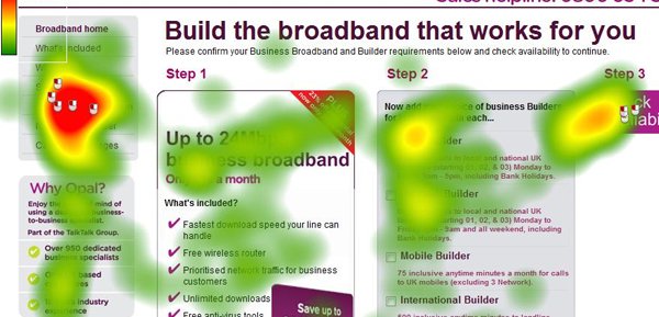
In addition, consider implementing tools like heatmaps and clickmaps. This will show you where people look and click by overlaying the data visually onto screen shots of your webpages. Areas where pages go dark may contain content that can be cut.

3. Give everything room.
One of the best ways to ensure visual elements (including text) get noticed is to give them space. Space creates emphasis. You cannot help but look at a small black square in the middle of a blank white page.
This example may be a bit extreme, but its lesson is valid. Negative space helps draw attention to the places things do exist. On a micro level, make sure there is enough space between lines of text and between images and surrounding copy so that the page does not feel cramped and difficult to read. On a macro level, place enough space between ideas so that a reader can easily move from section to section, understanding topic transitions without confusion.
4. Design for scanning.
People do not read webpages as they do books. They scan, starting at the top right corner and moving down. To accommodate this habit, present them with segmented, easily digestible pieces of content.
People generally read the first one or two words of a sentence and the first one or two sentences of a paragraph. Use short paragraphs to keep them engaged. Break pages up with headings and bulleted lists. Use pops of color to identify important items. Remember that while some people will read an entire page, most people will not, and these people need to be able to understand the content within the first one or two sentences of each section.
Simplicity is hard. Developing clear branding, uncluttered content and clean design requires an investment of time and mental energy. But the investment pays off. People are more likely to understand and remember a precise, simple message.


