Large or small, no law firm can escape the size constraints that apply to their website’s main navigation. The screens we use to consume web content produce an unyielding reality that all firms have roughly the same amount of real estate to display their most important links.
Visitors use your law firm's website’s main navigation as a go-to when either they first land on a site or when they need to navigate out of one area to another of greater interest. The logo and top navigation are the two most viewed elements on a website.
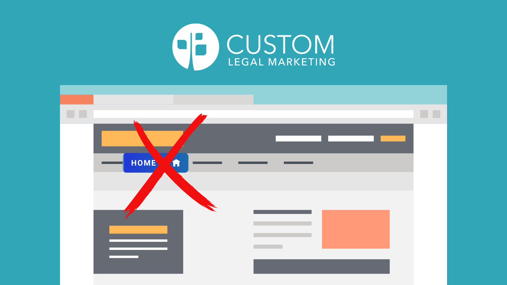
The links you choose to put in your main navigation will be critical to helping visitors navigate smoothly. Because this space is so precious, we do not include a textual home link in our newer website layouts. And we are commonly asked by clients why we have excluded it. There are a few reasons.
The home link is unnecessary.
Statistics vary according to source, but multiple studies performed between 2020 and 2023 report that 80 to 90 percent of consumers research a product or service provider online before they make a purchase decision. Everyone now carries tiny supercomputers around in their pockets (ie: the phone you might be using to read this article), and they use them prolifically. The argument that users are not savvy enough to get back to your home page without a textual link is no longer true. The internet user has evolved.
Textual home links have been replaced with logos that link to the home page. According to research performed by Epix Media, 95 percent of internet users know they can get back to a home page by clicking on the site logo. Data collected by Startups, a platform that offers support to new businesses, showed that there is no significant difference in home page traffic between sites with and without textual home links. People understand how to navigate to the home page either way.

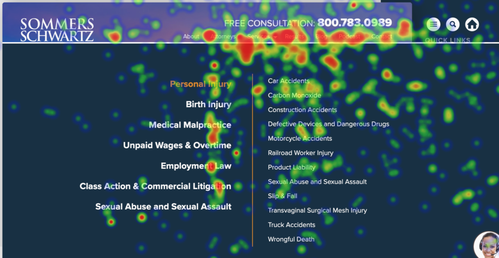
Custom Legal Marketing's own research, which includes heatmap and other user experience data reflecting the onsite behavior of millions of law firm website visitors, shows that the heat is in the navigation... not the home button. In one experiment (above), we added a home icon in the header. Nobody uses it. There is light clicking activity on the law firm's logo, a ton of activity on the main navigation, and zero clicks on the home icon.
Simplicity and the paradox of choice
Psychologist Barry Schwartz has famously argued that too many choices lead to unhappiness and stress. His book, The Paradox of Choice, describes a phenomenon in which people become overstressed by choice and refuse to decide at all.
While this theory has been most applied to retail sales, user behavior data from our clients’ websites supports the idea that it can also apply to website navigation. We have seen increased engagement with all menu items when the number of top-level links is decreased. Similarly, users are more likely to click on a conversion-focused button like “Get a Free Consultation” when there is one, large, clearly highlighted choice instead of several competing CTA options.
We've seen this with multiple phone numbers. After we removed the 2 phone numbers in the header of Wirtz Law's website and just used 1, phone calls increased 62% the next month!
Two Phone Numbers (low call volume)

One Phone Number (62% increase in calls the next month!)

Removing the home button simplifies the user’s experience. It helps take unnecessary decisions off the user’s plate and presents only the most important information upfront. It also clears up space so all other links can have more room to breathe and therefore, be more readable.
The home page is no longer critical to user experience (or Google)
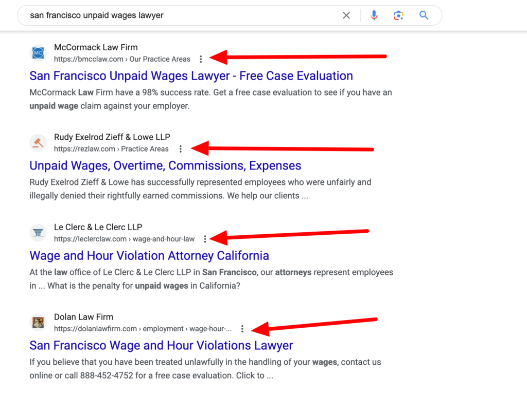
For some time, Google has been steadily devaluing the home page in its search results. For example, if someone is in San Francisco and their boss isn't paying their overtime or owed wages, they're going to search for a lawyer. When they do, Google is going to serve a list of pages that are dedicated to unpaid wages and overtime... not homepages.

It is therefore becoming more likely that a visitor will never see your home page at all. If the information they need is presented on a relevant secondary page, navigating to the home page will not be necessary. When a site is well-organized, your future clients should be able to use your site’s navigation to move from page-to-page smoothy without returning home.
For example, think of a trip to an amusement park. When you first walk in, you will likely look at a map to decide where you want to go first. After you have visited that first attraction, you don’t go back to the entrance. You follow the internal park navigation to get to the next place you want to go.
When a park is well-designed, you don’t have to keep retracing your steps. You move from attraction to attraction naturally. The same should hold true for your law firm's website.
Smooth navigation without a 'home' link
Helping users navigate your website easily is key to improving conversion rates. Those phone calls and leads are what your law firm's website is all about... not showing off your awesome homepage. A home link in the main navigation is no longer necessary.
So link your logo to your homepage and remove the 'home' button with confidence. Nobody will miss it because nobody is using it.

