Contact forms are integral to most websites. For law firms, they provide an easy way for prospective clients to contact you besides phone calls or emails. Generally, law firm contact forms gather the name, phone number, email address and other optional details of website visitors interested in learning more about legal services. The digital collection of these details helps lawyers keep track of leads.
Putting together a contact form is straightforward. What complicates things, however, is that most of today's web browsing occurs on smartphones and other mobile devices rather than desktop computers or laptops. As a result, lawyers need to ensure their contact forms are mobile friendly.
Mobile contact forms can be tricky as there is less screen space available, which can make interacting with forms frustrating to website visitors. The difference between a high converting contact form and a low converting one often comes down to the details, such as the simple design decision to use one column over multiple ones, or the choice of a red call to action button instead of blue.
If your contact form is not yet optimized for mobile users, you risk losing valuable leads and conversions. Here are some simple tips to help law firms improve the design and functionality of their contact forms so that they work effectively on mobile devices.
Opt for a one column layout
One of the basics to get right when creating a contact form is the layout. A single-column layout instead of multiple columns is the preferred option for mobile optimization.
Eye-tracking studies have shown that form fields positioned vertically rather than side by side are more effective. Placing form fields in a single vertical line works well because mobile users are accustomed to scrolling up and down the screen rather than horizontally to see the entire form. Additionally, the simple layout eliminates visual clutter, creating a better user experience.
Filling in a form from a laptop or desktop computer tends to be simple because you have a mouse and keyboard that makes it easy to select the desired field and enter data. However, navigating a multi-column form can be hard on mobile devices.
Choose the appropriate fields
Another way to simplify mobile contact forms is to limit the number of input fields to only those that are necessary. Most law firm contact forms will have basic fields like Name, Phone and Email. Lawyers can also add an optional Details section where website visitors have the opportunity to enter additional information such as questions they have about a legal issue or service. However adding a Subject field, for instance, may not always be required.
Having to spend extra time reading each field label, inputting information and then scrolling to the next field can be a frustrating process on mobile devices. The shorter and easier the form, the more likely people are to complete it. The same principle applies to the fields themselves. For example, avoid splitting the Name field into First Name and Last Name. Instead, combine fields that logically go together and place only one field per horizontal line.
According to Hubspot, using three fields instead of four boosts conversion rates by 50 percent. Quicksprout agrees that there are benefits to limiting the number of fields to three, pointing to research that shows it can guarantee at least a 25 percent conversion rate.
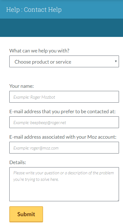
The placement of field labels is also an important consideration in form design. They are usually positioned above the corresponding field so that users can refer to them quickly. Labels can even go inside fields as ghost text in a lighter color to indicate what goes where as well as the required format, such as for phone numbers. For example, Moz’s mobile contact form has labels above each field as well as ghost text inside telling the user how to input information. The Details box says “Please write your question or a description of the problem you’re trying to solve here.”

Avoid using Captcha
Captcha form fields are designed to prevent spam form submissions. They usually require website visitors to answer a question, click on certain images or solve a math problem in order to submit a form. While captchas do a decent job of filtering out spam and thwarting bots, the general consensus is that they are annoying, especially on mobile devices.
What’s more, captchas can have a negative impact on conversion rates. People do not like having to engage in an extra, seemingly unnecessary step when filling out a simple form. Captchas can sometimes take multiple attempts to complete successfully. Video-making app Animoto found that removing captcha from their forms led to a 33 percent growth in their conversion rates.
The purpose of captchas is to provide security, which is undoubtedly important for building trust with prospective clients. However, there are other ways to address security concerns on mobile forms that are likely to be less frustrating for users.
Some contact forms, such as WPForms, have built-in honeypot protection that uses invisible code to catch bots without inconveniencing users. Another alternative is Google’s reCAPTCHA, which asks people to simply click a button to identify themselves as human. Law firms have several options to consider for the security of their mobile contact forms.
Make sure call to action buttons stand out
Every contact form should end by encouraging website visitors to take an obvious action. For law firms, it generally involves providing users with a call-to-action (CTA) button that allows them to submit the information they have entered.
All too often creating an easy-to-see, user-friendly button is an overlooked step in mobile contact form design. Clicking on a submission button after filling out a contact form is simple when you are using a regular computer. However, there are several issues that can crop up when attempting to do it on a mobile device.
Make sure your CTA buttons are large enough for easy tapping on mobile devices. The text within the button should be clearly visible and tell the user exactly what is happening, such as Submit or Send. Avoid placing the button too close to other fields or elements. If the Send button is located right next to a Cancel button, there is a risk the user will tap the wrong one.
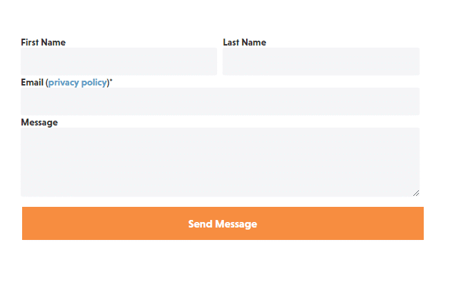
Law firms can also use contrasting colors to highlight the CTA button. Bear in mind that while colors should pop out, they should also correspond to your website’s design and layout. For example, the contact form on PeopleMetrics.com ends with an orange CTA button that says Send Message.

The color stands out from the form’s white background and the blue banner on top while still being on-brand for the company.
