Any firm can pull together a contact form for their website, but is it attracting visitors? Even more important: are these visitors completing the contact form and ending up satisfied with the experience?
An aesthetically pleasing site design does not necessarily equal excellent conversion rates. It is extremely important to make the lead comfortable while navigating the contact form, guiding them towards trust and comfort with the law firm.
So, what are the best ways to increase your conversion rates and the effectiveness of your contact form?
1. Make it brief.

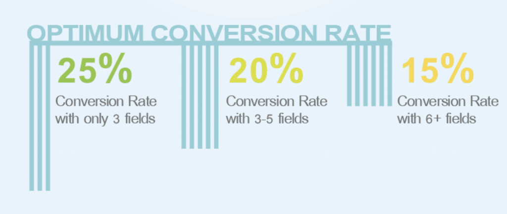
Graphic: Quicksprout
The most immediately obvious aspects of the form are length and aesthetic. The contact form should visually match the rest of the website and should not appear overwhelming; otherwise, the potential client is already lost. Questions should be kept to a minimum with approximately 3-5 fields. Quicksprout’s study highlights this:
Conversion rates are also visibly increased when there is variability. Rather than asking for a typed answer to all questions, an alternative is to have a drop-down of a list of choices. When typed answers are required, make sure that the questions are warm (but direct) rather than one-worded and cold. For example, rather than just having “Subject,” it could read, “What would you like to inquire about?”
2. Make mandatory only what’s necessary.
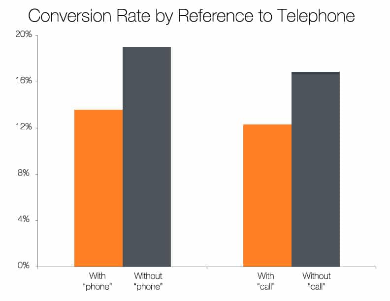
Make sure that the website emanates trust. For example, conversion rates rise when the phone number field is optional because some potential clients may not want to give out specific information. Dan Zarrella of HubSpot studied the conversion rates with “phone” and without:

Graphic: Hubspot
However, it is still important to maximize connection and to make sure all important fields are mandatory. What does your firm absolutely need from the potential client? What can still be optional?
If you are still debating over what to include, try an A/B test to see what strengthens conversion rates. It’s that simple.
3. Make the form user-friendly.
Take away anything that might cause unnecessary friction. Provide help text on the side of the fields or ghost text to explain what goes where as well as the suggested style of input. For example, if you are asking for a phone number, the ghost text might read “(xxx) xxx-xxxx.”
You can also highlight the field that the lead is currently inputting information into. This is especially important if the lead gets distracted and doesn’t want to have to navigate where they are in the process. In-line validation can also be used rather than having corrections requested after “send” is pressed; no one wants to hunt down the fields they incorrectly inputted.
Be careful of your tab order. If the “send” button is right next to “cancel” and you have a fast-paced lead, the wrong button might be pressed in a hurry.

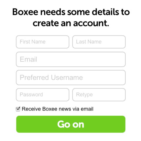
Graphic: Quicksprout
4. Make them happy they pressed “send.”
Once the form has been filled out, what does the lead press to send the information? The word “submit” has quite a negative connotation – a “get started” or “send” button is more compelling to press.
And then what happens? A short “Your response is appreciated; we’ll be in touch shortly”?
Even though at this point the lead has given you their contact information, you want to make sure you maintain a good relationship so they want to continue working with your firm. Rather than having a short blip of a “thank you,” have a positive confirmation and suggested links to relevant blogs and/or videos on your firm’s website. This keeps the lead connected with your firm and might answer any simple questions they have for you.
After this, the visitor should receive a response email — but not just an automated reply.
What if you had a detailed personal email from your CEO or founder, complete with an estimated time that you will get back to the lead?
Escape generic responses; you want to keep your lead interested.
5. Make a plan.
It’s easy to spend a lot of focus on getting those forms filled out, but are your leads staying satisfied? Make sure responses aren’t getting lost in your inbox. An alternative would be to automatically send emails to a separate folder, or use a specific subject line that you won’t miss.
Keep your sales process structured; even if you’re in a startup, going with the flow will weaken your organization skills and hurt your success rates. You can even make separate profiles for each lead, complete with information from the contact form and from other means of communication you have had with them.
Make the lead’s ease your priority – the results will be enormous.
Hannah Felfe is a writer at Custom Legal Marketing.
