Web design trends change naturally as technology evolves. Ideas that were once considered experimental become mainstream, and design components that were once mainstream eventually become obsolete.
As the zeitgeist of design evolves over time, one constant remains true: first impressions matter. Up to 75 percent of consumers still report that the visual appeal of a website influences their decision about whether to trust a business. Design still matters.
Understanding current design trends can help your firm decide which might be right for you and which are just fleeting designer fancies. Here are eight trends to watch in 2018.
Illustration
Photography has dominated website design for some years. Large hero images — those that fill the entire top of the page before the scroll — and large background images surged in popularity as technology gave users access to faster and faster internet connections.
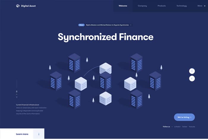
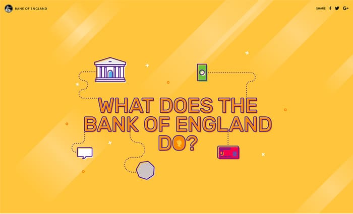
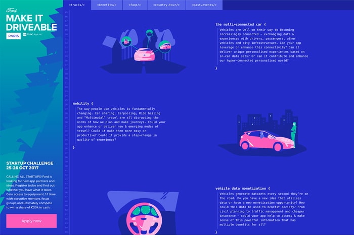
The large hero image has enjoyed the particular favor of businesses and personal bloggers worldwide for many years. But as users continue to demand lighter and faster pages, its popularity is beginning to wane. Designers are increasingly turning to custom illustration to add interest and personality to web pages — and to replace the hero image.
Illustration offers many advantages, perhaps the largest of which is its relative weight. Illustrations are defined mathematically and therefore require very little bandwidth to load. Since Google uses page load speed as a measure of user-friendliness and as a ranking factor in its mobile-first index, switching to illustration can give your site an advantage.
Illustrations can also be customized in many ways that photography cannot, giving website owners the ability to create exactly the look and feel they want. And illustrations can be used to convey complex concepts in a way visitors can more easily understand.
Larger than life typography
For many years, designers were restricted in their choice of type to only a few web safe fonts. Now, web fonts are widely available and relatively inexpensive. Many are free. Google offers a collection of web fonts that are free for anyone to use. Now, fonts can shine.
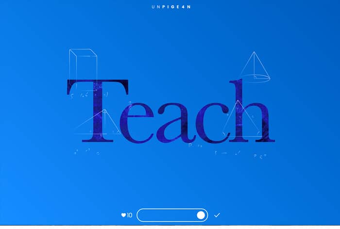
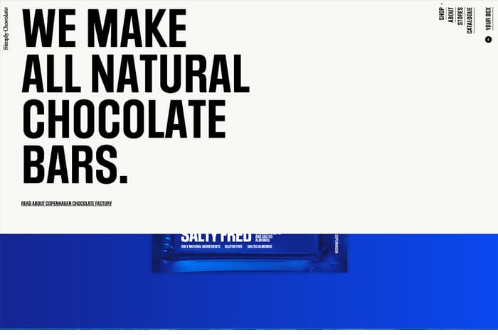
Websites are incorporating large type elements and interesting display fonts. In some cases, typography becomes the design element, replacing illustration and photography as the focal point of a page.
Using type as a design element offers similar advantages as illustration. Type is lightweight and can be easily scaled for reading on any device. Websites that rely heavily on type to convey a specific look and feel will be able to provide a seamless experience no matter how a visitor accesses them.
Speed
Your website has to be fast. Internet users have proven that they have the patience to stay on a website and read through long pages. But they do not have the patience for pages that load slowly.
Google has been emphasizing the importance of page load speed for years. A 2016 DoubleClick study found that 53% of mobile sites are abandoned if the pages take 3 seconds to load. And users will only continue to expect more speed.
Modern web layout must focus on being lightweight and easy to use. Every element that is added to a page should be carefully considered for its utility and necessity. This is not to say that you must have boring pages, only that any interaction, graphic or other content should be added intentionally to enhance user experience, not merely to show off.
Geometry
Geometric and card-based layout is not new, but it is enjoying a resurgence in popularity due to the growth of mobile device use. Rectangles scale easily from large screens to small and provide a simple way to group different types of content. Cards are also familiar — anyone who uses Google or an Android device is used to browsing content with cards.
Familiarity can be an advantage. When people understand naturally how to interact with your website they are more likely to do so. Familiar patterns provide comfort and make it easier for visitors to consume content and make decisions.

Personalization
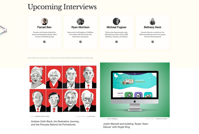
Whether you realize it or not, you expect personalization from certain websites, particularly e-commerce platforms, which show you custom recommendations based on your browsing and purchase history. Websites you visit often or are a member of will greet by name and serve you content that is likely to conform to your preferences. Increasingly, your experience with websites and search results is unique to you. Personalization is a trend that will only grow as machines continue to harness larger and larger amounts of data.
Personalization is possible on attorney websites, and if done correctly it can enhance a user's experience with your site. Visitors can be served different content based on available data, like the location of the visitor, or pages the visitor has viewed in the past. Some personalization software uses machine learning to uncover patterns in the way users behave on your website and then predict what content will appeal to different types of people. Some serves content based on customizable if-then parameters.
Bright colors and gradients
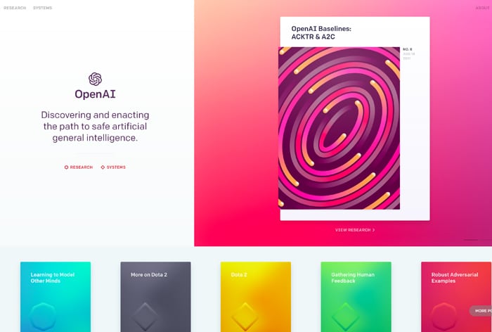
Websites are getting brighter and brighter, employing colors that would have frightened many businesses in years past. Large, bold graphics, patterns and gradients are taking over web pages, again replacing more traditional design elements like photography.
This trend is fueled by the rise of apps, which frequently employ bright color schemes. And it is a trend of which attorneys should be cautious. If bright colors match your firm's personality, by all means, start experimenting. However, bright colors can be a challenge for users, particularly older individuals, because they can make a web page harder to read. Carefully consider your audience before jumping on the bright color bandwagon.
Additionally, the bright color trend has a lower probability of longevity than a more classic trend like minimalism. Employing over-bright color schemes may quickly date your website, leading to an unnecessary expense of updating it before it would otherwise be necessary.
Open composition and asymmetry
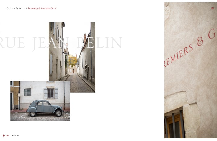
Websites no longer fit into easily defined pixel sizes. People are looking at websites and applications on huge television screens and small smartphones. As a result, many designers are eschewing the trend of cards and geometry and abandoning closed layouts in favor of open compositions.
Open composition website design breaks out of traditional column constraints. Page elements may float or overlap each other, or they may seem to fall off the side of the page. Many websites that employ open layout also use parallax scrolling, where different layers of the site scroll at different speeds. Some use animations to transition between pieces of content in the absence of a more concrete structure.
Open composition design can be compelling and visually interesting, but it is risky for industries that need to convey a lot of information on their websites. Overlapping text and images can be difficult to read, and pages that do not clearly section content can be tiring for visitors. Attorneys should use this trend selectively.
Micro interactions
A micro interaction is a task-based engagement that indicates a user has performed a specific activity. A micro interaction provides instant feedback to the user. If executed well, micro interactions are almost unnoticeable, but without them many websites would seem inexplicably boring.
Examples of micro interactions include a brief noise that indicates a button has been pressed or a small animation that shows a screen has been tapped. You experience micro interactions when you use the keyboard on your phone, like or recommend something on a website or give a star rating.
Design trends often become popular for a reason; they solve a problem or offer a unique way of consuming information. However, some trends will experience longevity while others will fade quickly away. Good website design is more than a pretty layout. Functionality, speed and usability all influence how positively or negatively people will view your website. Never jump on a trend just because it seems cool. Always analyze your user base and your website goals first.


