Two metrics that are often used to determine a website's performance are time on site and bounce rate. Bounce rate is the percentage of times a user clicks on a page and leaves without visiting any other page; in other words, the percentage of single-page visits. A high bounce rate can indicate that your landing pages are not providing visitors with the information they need. However, a high bounce rate paired with high conversions can indicate that people are finding what they want immediately and don't need to go anywhere else.
Time on site is exactly as it sounds: the total duration of a website visit. Time on site measures the entire length of a visit across all pages.
Generally, firms should strive to have a low bounce rate and a high average time on site. The longer a visitor spends on a site the more likely he or she is to view the site, and by correlation its owner, as a trusted authority. And the more your website is able to answer readers' questions, the more likely they are to believe your firm can solve their problems.
Here are seven things your firm can do to increase your visitors' time on site and your likelihood of converting them to leads.
1. Provide useful information
The first thing you should consider when creating any form of content is your reader. Who is this person likely to be? What is he or she looking for? What can you do to help this person solve his or her problems? Readers do not want to waste time on content that isn't relevant to them.
Do not belittle your readers by providing thin, generic content that they could easily find anywhere else. Your visitors are most likely more savvy and more hungry for information than you give them credit for being. Despite all of the warnings marketers receive about short attention spans and information overload, statistics show that users prefer long, content-rich pages.
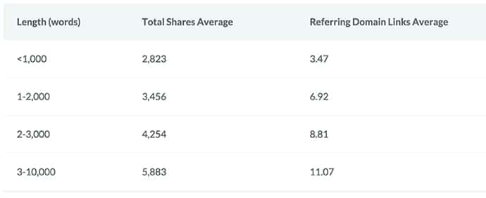
Recent research performed by Moz and BuzzSumo confirms what several other studies have found: longer content performs better than shorter content. Longer pages are more likely to rank organically on the first page of Google. And longer pages are more likely to earn shares and links. Moz and BuzzSumo analyzed one million articles and found that pages containing 3000 – 10,000 words received the most engagement and earned the most inbound links.

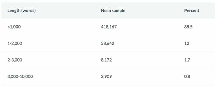
The performance benefits of longer content have been known for several years. SEO research company serpIQ performed a much cited study in 2012 that showed pages containing more than 2000 words rank better than their shorter counterparts. However, most websites are still publishing shorter content. In their large, million article sample, Moz and Buzzsumo discovered that 85 percent of the articles had less than 1000 words. Your firm can (and should) take advantage of this fact.

Source: https://moz.com/blog/content-shares-and-links-insights-from-analyzing-1-million-articles
Of course, not all content can be long-form content. But it can all be carefully crafted with your audience in mind. Whether you are posting a video, writing a FAQ or explaining a service, your content should always speak to those who are most likely to read it.
2. Incorporate interactive elements
People like to be actively involved in the learning process. This is true online and off; if you attend a class or seminar, you are likely to get more out of it if it includes games, Q&A sessions and other chances to connect with those sharing the information. Think of your website in the same way. Visitors are more likely to stay engaged and to remember you if they are not just passive viewers.
Web pages communicate with visitors in a number of ways. There is the obvious written or audio-visual content that constitutes the bulk of information on a page. However, there are also more subtle communications, in the form of hover effects and animations, which are used to indicate how the user can interact with the page.
Here are some easy ways to add interactive features to your pages:
- - Ask for feedback in the form of quizzes or polls. You can build short, easy to use surveys with general topics, like “What are your top concerns when hiring a lawyer?” or practice-specific topics, like “What is most important to you when pursuing a divorce?” Provide answer choices and, of course, a space for visitors to enter their own opinion.
- - Incorporate step-by-step slideshows that explain some aspect of working with you or some part of the legal process.
- - Create interactive infographics that visitors can click through to learn more about specific parts of the law.
- - Create cards that ask a common question and then flip to reveal the answer.
When you give visitors something to do, they are more likely to stay, learn and contact you.
3. Tell your story
Attorney bio pages are some of the most visited pages on a law firm website. People are curious about the individuals with whom they will be working. From a prospective client's perspective, learning more about attorneys and staff — and being able to see them as real people — helps build trust.
What goes into a good bio or about page?
The most important thing you can give an about page or attorney profile is personality. What is the philosophy of your founders and how does that influence your firm's culture? What is your mission, and how does that work to help your clients? Tell the story of how and why the firm was originally founded, and interject personal anecdotes when appropriate. You may find you have hobbies or interests in common with prospective clients that will make it easier to break the ice and connect during an initial consultation.
Think of what you would want to know if you were researching an attorney. Ask others about their perception of your firm to uncover places where they are on point and places where more information would help create a more accurate impression. Provide client testimonials so visitors can see others have benefited from working with you. Don't fall into this trap:

In terms of SEO, thorough bio and about pages can help give your site authority. In its Search Quality Rating Guidelines, Google tells its raters to look for information about the business that owns the website, including sufficient contact details. If not enough information is present, Google instructs its raters to assign a lower quality score. While rater scores do not directly affect a site's rankings, the Guidelines do indicate the types of things Google is looking to incorporate into its algorithm.
4. Keep content fresh
Nothing will turn a visitor off more quickly than a chart on your website showing, for example, veterans' pension rates for 2006 or cutting edge estate tax strategies for 2011. Both Google and your visitors expect up-to-date, useful content. Onsite blogs should be updated regularly — at least once a month — and pages should get continual refreshes as new information becomes available. Any page can be updated with fresh analysis or graphics even if the bulk of its content is still relevant and accurate.
5. Pay attention to design
Humans are visual creatures who make subconscious judgments based on appearance. Our tendency to make snap decisions on looks alone is deeply rooted in a basic survival instinct — the ability to determine who or what may pose a threat to us — and it is difficult to counter. According to statistics released by Rareform New Media, 48 percent of internet users say that a company's website design is the top reason they use to judge the credibility of the business. And overall, more than 90 percent of buying decisions are influenced by visual cues.
A user's first impression may determine whether they decide to stay and investigate your firm further. This is, for better and for worse, part of human nature. Your firm can take advantage of this intrinsic trait by presenting visitors with a smart, modern design that incorporates the following:
- - Pick colors and graphics that showcase your firm's personality.
- - Reduce cognitive load by simplifying your design, removing unnecessary text and incorporating white space.
- - Make it easy for visitors to make decisions by presenting a clear call to action and limited navigation options.
- - Make content easy to read by breaking it up into into digestible pieces. Use headlines, sub headlines and bulleted lists to add visual interest and help people quickly scan your pages. Group visuals strategically with related copy and break sections up with color and space to help differentiate between topics.
6. Connect your content
No page should lead to a dead end; a visitor should always be given something to do next. Some pages may lead the visitor to contact you by filling out a form or starting a live chat. Others may lead visitors to download some form of content.
Connecting content in the form of internal links and recommended articles is a great way to keep readers from hitting a wall. Internal links are links to other pages on your site from within the content of the page. If you write a page discussing car accidents, for example, you may want to add internal links to a page of automobile safety tips or a checklist of steps to take after an accident.
Recommending further reading at the end of a page or post is also a great way to keep visitors engaged. News sites are particularly good at using this tactic. As you scroll through an article, you may notice buttons appear on the sides of the page that will allow you to click through to another piece. Or, you may notice a slide in with a link to a related story. All of these methods serve to keep you clicking from post to post and spending more and more time exploring the site.
7. Set the right tone
People communicate less formally online than they do when meeting in person. Years of interacting on blogs, social media and forums has made it feel natural for people to speak casually with each other in these settings.
Your website will hold people's attention longer if you add personality and speak to visitors using a tone and language they can relate to. While you should always remain professional, you must also be human. Do not talk down to people or use jargon they won't understand. Give examples of what people can expect the experience of working with you to be like. Take advantage of the opportunity your website provides for you to connect with prospective clients on a personal level and create a positive impression before you even meet.

