Online marketing succeeds with conversion. Moving up in search rankings is a critical step. Enticing people to click on your listing is another. But getting the lead — that is a culmination of efforts. And design plays a role in making it happen.
All of the time spent nurturing organic rankings and money spent on pay-per-click campaigns can quickly be flushed away on a poorly designed mobile landing page.
You cannot assume that your landing pages will be helpful to users regardless of the device they are using to view those pages. In fact, our research shows that specially designed attorney landing pages do not perform well with desktop users. People searching for an attorney on a desktop like information-rich pages, and it is often most effective to send them directly to practice area sub pages relevant to specific queries.
The same does not hold true for mobile landing pages. Mobile users have different behavior patterns, and your pages must be optimized accordingly. Too much information in this case can be a burden. Here are five ideas you can implement to help create a positive mobile user experience that drives conversion.
1. Choose words wisely.
Mobile phone users, who are often searching while in public and on the go, are looking to find specific information quickly. Therefore, mobile landing page content needs to be concise and to the point. Try writing initial content freely. Then cut it. Really pare it down, by at least 50 percent. It is almost always possible to eliminate words and make sentences more compact.
Pay attention to the order of your copy. List benefits up front and explain how your services can help solve a problem. Try to immediately pull readers in and show them why they should remain interested.
During this process, avoid writing content that is overly salesy. Do not use too many unsupported superlatives or modifiers, like “best” or “especially” or “very.” These words are imprecise, and users see through them quickly. Specific, well-chosen details make copy more persuasive.
2. Understand the goals of mobile users.
Attorney websites are informational. They generally fill at least one of two roles: research or verification. Some people come to the process of hiring a lawyer with no past experience and no references. These individuals need questions answered about what the firm can do and whether it is a good fit. Others may have received a referral and visit a site in order to check the firm out and verify it firm can handle their issue.
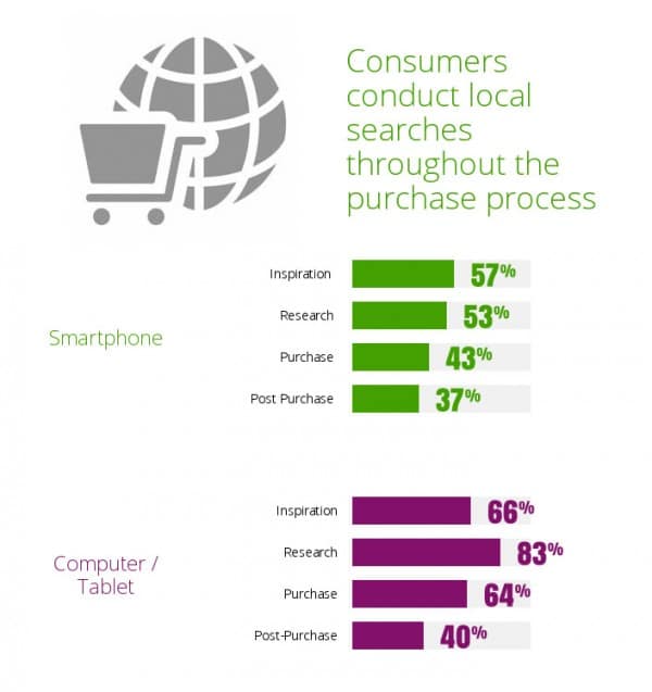
Mobile users have different needs. The realities of screen size and physical location modify what they want to or are willing to do. According to a Google Mobile Search Study, 83 percent of searchers use a desktop machine for research, while only 53 percent of mobile searchers conduct research on a smartphone. The smartphone is simply not conducive to in-depth investigation; users have less time, less screen real estate and are often on the go when searching. They are also more likely to be looking for a specific piece of information, like a phone number or address. If they click through to your page, they need to find what they are looking for quickly.

Research also shows that people are still hesitant to make a final purchasing decision from a phone. They may use their smartphone as a filtering device, completing the transaction later on a tablet or desktop. According to Alex Harris of Alex Designs, this means lead generation should be a primary focus of mobile landing pages.
The lead generation paradigm works for attorneys; it is easier to gain a new client through a phone call or face-to-face interaction. Landing pages should give users enough content to establish a level of trust but not so much that they lose interest, are overwhelmed or become frustrated by an inability to find what they need.
The good news is that 73 percent of mobile searches lead to follow-up actions, according to SearchEngineLand. Mobile searchers are often ready to act, and quickly.
3. Simplify everything.
One of the biggest complaints mobile users have is slow-loading pages. According to Mediative, 73 percent of users think mobile load times are too slow, and 74 percent will abandon a page if it takes five or more seconds to load. Load time is key to keeping visitors on your page.
Visually, stuffing too many page elements into a small space is confusing and tiring. Reduce the number of images (one is probably enough) on mobile landing pages, and optimize all images for fast loading. Stick with one font, and use a limited color palette.
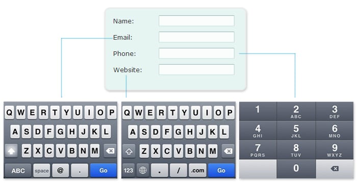
If you use a form, keep the number of fields to a bare minimum, and make the form easy to fill out. You can control the keyboard a user sees by labeling the form input fields. The label for phone, for example, is “tel.” When someone taps on a field labeled “tel,” he or she will see a keyboard with only numbers. Similarly, a field labeled “email” will produce a letter keyboard with an @ symbol.
4. Use one call to action.
Mobile users, like desktop users, need to be clearly directed to take a specific action. Mobile landing pages perform better when they have only one focus. If you must use secondary calls to action, for example featuring a complementary practice area or relevant seminar, put those at the bottom of the page and make the primary call to action clearly dominant.
Remember, your call to action can be a phone number. If you are using your pages primarily as a source of lead generation, a phone number or “click to call” may be the most effective type of call to action.
Thorough testing is the only way to see which calls to action work best. Test the performance of a phone number verses that of a button. Test different button and click to call language. Consider offering a benefit to the call to action, like specifying you offer free consultations, if that is the case.
5. Focus on readability.
Everything on a mobile landing page must be easy to read and easy to click on. Choose a font size that allows users to read the page without zooming in. Give links and buttons a lot of space, and make them large enough to be easily tappable.
Consider breaking up copy with bulleted lists and headlines. Bulleted lists help distill ideas down to their most basic, easy to digest parts, and the area between the list items adds welcome white space to the layout. Headlines draw people's attention to the most important information and make pages more easily scannable.
Mobile and desktop search results are becoming increasingly divergent. People are seeing different listings when searching from a mobile device and are expecting a different experience. Some simple adjustments will help your pages live up to expectations.


