Your firm's website is working for you day and night, whether you are in or out of the office. It is many people's introduction to your firm and the only interaction they may have with you before deciding whether to call. You must get visitors' attention, and you must get it quickly.
Your website's design should support your firm's overall image and goals, and while each attorney website will be unique to the individual firm's voice and message, there are some things all firms can do to help build a more successful site.
1. Responsive design
In 2014, no one should doubt the value of a good mobile site. According to a Telmetrics Mobile Path-to-Purchase study, 46 percent of searchers use mobile exclusively when doing research online, and Google predicts that mobile searches will outpace desktop searches in 2015. Half of mobile searches are performed because the user is looking for a local result, which is particularly relevant to attorneys who are based in a specific geographic area.
Users spend an average of two hours a day on mobile devices, and they expect a good experience on every screen. If your firm's website is not mobile friendly, you can lose clients and recommendations.
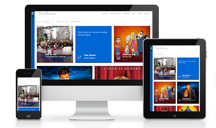
A responsively designed website adjusts fluidly to fit the screen width of any user's device through the use of CSS media queries. Users see the same html code on the same URL, and there is no need to program a specifically mobile page at a different address, like www.mobile.example.com. With responsive design, you do not have to try to anticipate every screen size (which is nearly impossible) and try to program pages specifically for those devices. Instead, your pages adapt, giving visitors a consistent experience no matter how they visit your site. Google's official stance is that responsive design is the preferred method for serving mobile websites.

Time Warner's website adjusts fluidly to fit screens from desktop to phone.
2. Great bio pages
Attorney bio pages are some of the most visited pages on a firm's website. People care about the experience and personality of the person or people with whom they will be working. Treat visitors to a comprehensive bio page that clearly explains how your interests, passions and legal background combine to help clients. Include personal information. Personal information gleaned from bios can be used to help form a relationship in future correspondence. Do not just publish a resume style list. Lists are not memorable, and resumes do not make an emotional connection.
In addition to writing great content, give the design of your attorney bio page the attention it deserves. Have a professional picture taken that can be used on both your bio page and social profiles to maintain a consistently polished look. Include positive client testimonials, relevant memberships and awards. Make navigation within the page easy. If you have a lot of information to present, consider using tabs or navigation drawers, which open and close to show and hide content. This will help keep the page clean and scannable.
3. Obvious contact information
Visitors come to an attorney website predominantly for two reasons: to find information and to hire a lawyer. Generally the first leads to the second; once a user has researched your firm, he or she will contact you. Make that transaction easy by putting contact information on every page. The top right corner of a page is often used for essential items like phone numbers or account logins, and visitors are very comfortable looking for contact information in that area. It is also a good idea to place a phone number at the bottom of the page in the footer for reinforcement.

Custom Legal Marketing chose to provide a phone number and highlight the contact button with a contrasting color.
4. A single, focused message
Your website is one piece of your firm's overall brand. No matter how many practice areas you have or attorneys you employ, your firm's personality and identity must stay consistent in every communication at every point of contact.
Brand consistency begins off the coded page. Your firm should have a mission statement and a value statement. If you do not, it is never too late to create them. Your mission describes your firm's purpose, and your value statement describes the benefit you offer to clients.
Your firm should also be able to describe its personality. Think of your firm's personality in the way you would a human personality. What emotions do you want people to associate with your firm? How should you speak and act?
Your mission, value and personality will shape your firm's identity. The colors, fonts and images you use should all match the personality traits you have chosen. Firms tend to hire different service providers to help with different areas of marketing. You may, for example, employ a video company, an online marketing company and a local PR company. You may have different people handling your print ads and your web ads. Make sure all of these providers are using the same brand elements in all of your marketing.
5. Simplicity
Your visitors' experience will improve if your pages are uncluttered, easy to read and easy to navigate. Too much visual stimulation is stressful, and it interferes with the decision making process. Choose one or two fonts for all text, and give the words on the page the space they need. Break long paragraphs up with sub headlines or bulleted lists, and make sure there is enough space between individual lines of copy.
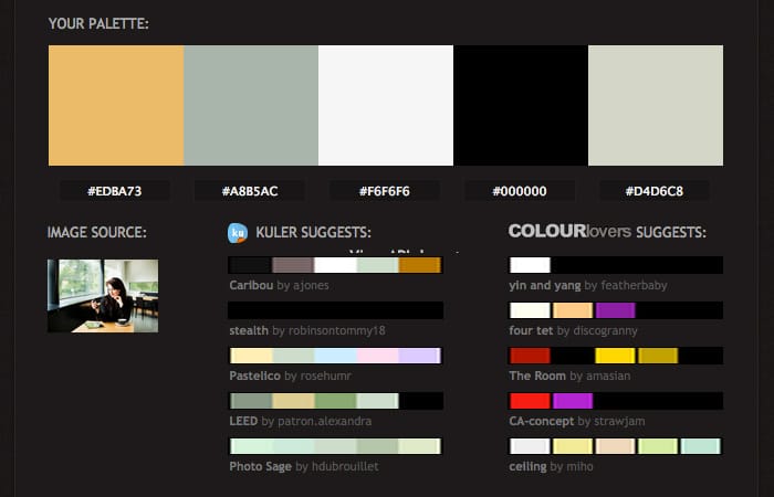
The same rule applies to color. Using too many colors makes a site look sloppy and unprofessional. Pick one dominant color and create a palette based on your primary choice. If you are curious about how different colors interact together, try using an online color palette tool like COLOURlovers, Adobe Color CC or Pictaculous.

Services like Pictaculous allow you to pull color palettes from an image.
6. A content strategy
Posting a few blog entries every now and then does not qualify as a content strategy. Having a content strategy in place means that your firm is giving thought to every piece of content and how it fits within your overall goals. Who are you writing for? How can you offer value to this audience? Is your content appropriate for the platform on which it is published?
After Panda hit a lot of sites in 2011, Google offered some guidance about the type of content it is looking for on its Webmaster Central Blog. One of the questions Google asks about content is:
Are the topics driven by genuine interests of readers of the site, or does the site generate content by attempting to guess what might rank well in search engines?
The takeaway? Write for your clients.
7. Distinct calls to action
What do you want visitors to do when they come to your site? For many firms, the answer is easy: contact us. Others may use a website as a confirmation of their experience and credentials. In this case, the desired action may be reading about attorneys or viewing representative case studies. Whatever the goal, make it clear. Tell visitors what to do with a prominent call to action.
Remember that not all visitors will arrive on sub pages by way of the home page. Often, people searching for information about a specific area will go straight to a sub page from the search results page. Sub pages should also contain all the tools a visitor needs to convert.
8. Reviews
Social proof is a powerful influencer. People are much more comfortable hiring a professional if they know others have had a positive experience. If you have client testimonials, post them on relevant practice area and bio pages. Encourage clients with whom you have a good relationship to post Google reviews. A high star rating next to your search results page listing encourages people to click.
9. Professional photography
Stock photography is easily available, which means any other firm can also use the picture you are using. Many lawyer websites use pictures of empty courthouses, Lady Justice, car accidents or arguing parents. These pictures say nothing unique about your firm.
Professional photography will help your firm present a polished, experienced image. Eye tracking research suggests that visitors engage more with photos they know to be of real people they can call or visit. A professional photographer can also help your firm come up with creative ways to capture interactions and show off your firm's personality. When having photos taken, try to steer clear of standard poses, like standing in front of bookcases, and give your visitors a reason to remember you.

