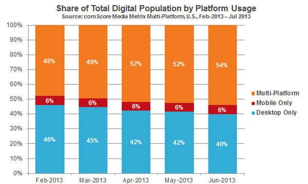
What are the implications of the new multi-platform reality?
In many localities, mobile devices are ubiquitous. It has become common to see an individual reading an article on a tablet while checking email on a smartphone. Consumers increasingly live in multi-device households and have come to expect websites to function well on all their technology.
In 2013, a tipping point was reached. The majority of internet users are now multi-platform, a phenomenon comScore has dubbed the Multi-Platform Majority. More that half of U.S. Internet users will access websites with multiple devices.
Ignoring this reality can lead to a poor user experience and subsequently poor conversion. An attorney website must be able to adapt to any device without making assumptions about how a substantial majority of people will be viewing the site. Those majorities no longer exist. Here are some steps you can take to ensure a smooth user experience for the new majority:
Understand your visitors thoroughly. Because you cannot anticipate a visitor's device with great accuracy, you must know that you are presenting him or her with appropriate choices, regardless of screen size. Anticipate the most important actions a visitor might want to take and make them easy to access cross-device. Website analytics will reveal which pages are most popular and what percentage of your traffic is mobile. Focus groups can help expose strengths and weaknesses in your navigation structure, showing where the process breaks down or visitors become confused. As you gather knowledge about potential clients, you will be better able to anticipate their needs, make their user experience enjoyable and convert them to clients.
Be selective with information displayed. Screen real estate is always at a premium. Desktop monitors may be the size of a small television, but a potential client might never make it to your site on a desktop machine. Modern development techniques allow programmers to specify which elements should be available to users on laptops, tablets and desktops. People who visit a website from a phone are most interested in finding contact information, while those who visit on a desktop may be able to take time to research your services. Control what different set of users see to reduce unnecessary choices and distractions.
Make contacting you easy. Multiple studies confirm that one of the most important items on a site from a visitor's perspective is contact information. For the benefit of mobile users, all numbers should be clickable. Addresses and maps should be easy to find. If you are open to the public, office hours are helpful, as is an easy way to make an appointment. If you provide contact forms, do not require too much information. Form conversion decreases quickly with each additional field. Forms are even more cumbersome on mobile devices and should be removed or kept to a minimum.

Do not rely on hover effects to reveal critical links and menus. Desktop visitors can prompt certain actions, like a button color change or a drop-down menu, with a mouse hover. And people have learned to expect such interaction. Mobile visitors, however, do not have the capability to hover over an item to reveal an effect. Links, therefore, have to be obvious without a hover. The brevity of space on a mobile device makes hiding sub menus a necessity, but options should always be easy to find and open.
Pay attention to load times. The growth of high-speed internet access has allowed for increased creativity and interactivity in website design. However, load times still matter. If someone waits for your site to load on their smartphone for more than two or three seconds, you have likely lost them.
Do not rely on slideshows to display crucial informational. Slideshows are an easy way to provide visually interesting navigation options to visitors using desktop machines. Slideshows have become incredibly popular as they are increasingly lightweight and easy to implement. However, some developers are moving away from slideshows since they do not work well on smaller devices. Often, the entire slideshow will have to be removed for mobile display. If you choose to employ slides on your desktop site, be sure that users have easy access to the information in a non-slide format should they visit on a smartphone or tablet.
Assume a single individual will access your site on multiple platforms to complete a task and make that interaction seamless. A positive website experience will reassure visitors and reinforce a professional, capable narrative essential to gaining trust.

